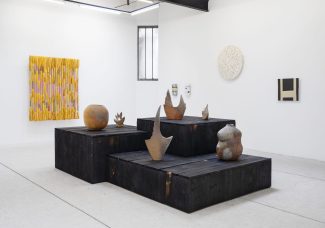

Contre-Soirées par DésamianT
Dans le texte de présentation de leur collectif, les jeunes curateurs de DésamianT s’expliquent sur le choix de cette appellation : « Locaux vétustes fermés pour amiante. Voilà ce à […]
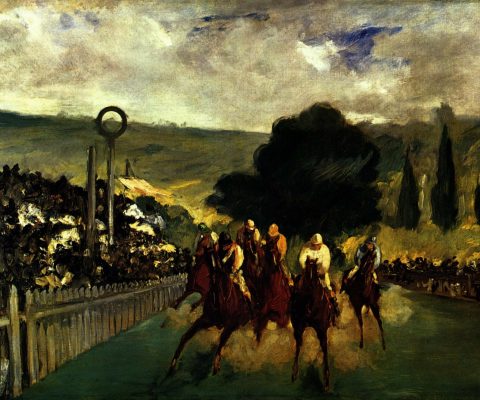
Art et/ou sport : le cas des pratiques équestres
Dans le cadre des Jeux Olympiques 2024 et de la politique culturelle qui y est associée, Art Critique accueille un premier dossier thématique constitué par des chercheurs. Intitulé « Art et/ou […]
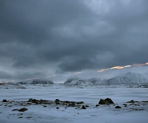
Qui sont les 12 lauréats du Prix Art Éco-Conception ?
La semaine dernière se tenait le jury du Prix Art Éco-Conception. Doté de 1000 euros pour chaque artiste primé, ce prix a pour but d’accompagner les créateurs dans la réduction de […]
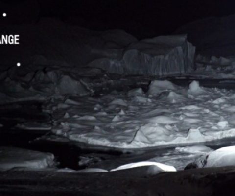
« une écologie des images » au cœur de l’Histoire
La galerie Analix Forever propose jusqu’au 1er mai 2024 une exposition explorant les dynamiques de l’écologie et les préoccupations contemporaines. Intitulée « une écologie des images », cette exposition orchestrée […]
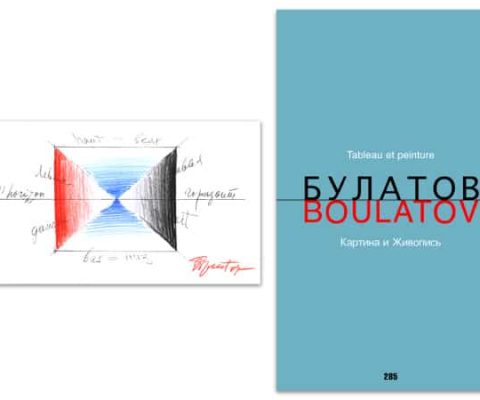
Tableau ou peinture ?
Il faudra un jour nous attarder, dans le cadre de notre rubrique « exposer l’exposition », sur les œuvres d’Erik Boulatov représentant des œuvres exposées. Il faudra aussi que nous analysions, pour […]
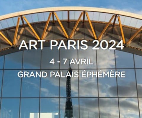
Art Paris, c’est ce week-end
La foire Art Paris ouvre ses portes ce jeudi 4 avril et se tiendra au Grand Palais Éphémère jusqu’au dimanche suivant. Pour cette 26e édition, elle présente les sélections de 135 […]

Revoir Van Eyck au Musée du Louvre
La restauration du tableau de Jan Van Eyck intitulé La Vierge du chancelier Rolin commencée en 2021 s’est achevée cette année. Pour fêter la fin de ce travail qui permet […]
